


Before you create an online donation form, you need to ask yourself a few questions.
- Is it simple and easy to navigate?
- Is it donor friendly? Do they know how to access it?
- Are you asking donors for the minimum required information?
If your answer is ‘NO’, buckle up and start from scratch. We have put together a list of qualities every donation form must have. Look at yours and make changes.
What clutters look like?
Clutter is the worst thing to have on a donation form. It drives donors away and creates havoc. It makes your page look terrible and causes loss of interest. Remember, donors don’t have the whole day to figure out how to donate, they either make one or don’t.
Clutter on your page looks like:
- You have way too many fields, driving away visitors
- Too many links or navigation elements distract donors
- You’ve bombarded the page with tons of information, causing disinterest
- Adding a lot of pictures is not a good idea
- You’ve filled the page with never-ending complex steps
Keep it simple & easy
You need to follow the reduce rule to make your donation form or page as simple as possible.
The reduce rule is:
- Bring down the number of clicks
- Remove distractions
By clicks I mean avoid multi-screen donation process with several redirects. Distractions might be videos you want to share or external links, which you can share on the receipt page.
Lengthy forms with way too many fields, which take over 60 seconds to fill deter potential donors. Many donation forms make the mistake of collecting irrelevant information that uses up a donors time and leads to a high bounce rate on the donation page. Only collect information relevant to the donation process. If you want to collect additional information, provide the option but don’t make it mandatory.
Make the privacy policy visible so people know the information they share is secure. Let them have access to it before they proceed to payment.
What to include in your form?
- Begin the form with the name of the donor, email address, physical mailing address, and billing information (credit or debit card information).
- The payment process is important, so put thought into it. Provide donors with multi-options like a credit card, debit card, cheque, wire transfer, PayPal, or Stripe.
- Provide a small description of what a certain about of money will do for the cause. This adds value to the money that the donor will give. But that doesn’t mean you give a lengthy explanation.
- Tipping allows your donors to cover payment processing fees. Giving this option will encourage more people to tip.
- Boost your retention rates by providing a checkbox that’ll enable recurring donations.
- After the donation process, redirect your donors to a page of your choice; homepage, a special thank you, donor survey or videos.
Provide different giving options
People are often unsure of how much to donate. Make it easy for them and provide different giving options. Suggesting donation amounts will encourage them to contribute more than they intended to and will speed up the process. Provide them with 4-5 donation options, from lowest to highest and a custom option (to fill in their own amount).
Lowest value: $20 to $50
Highest Value: $250 to $5000
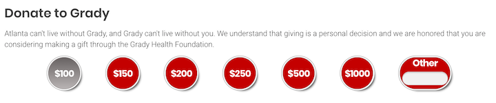

Don’t forget to provide the recurring donation option.
Match your page and brand
Your brand is everything. You’ve worked hard to create a great brand or are working towards building a great one. Which is why your donation page must be in sync with your brand. Non-branded pages do not build trust or credibility and donors will abandon your form. To prevent this, make your brand prominent.
Tip: Younger donors get turned off by outdated websites and are less likely to contribute. Keep up with the trends while building your website.
Go creative with the donate button
Instead of sticking to the same old button get creative and make the button stand out. Experiment with colors or language styles to make it more appealing to donors.
Use phrases like ‘Sustain our mission,’ ‘Donate,’ or ‘Transform lives Today,’ instead of ‘Submit’.
This gives donors a final reminder that their contribution will have a good impact on society.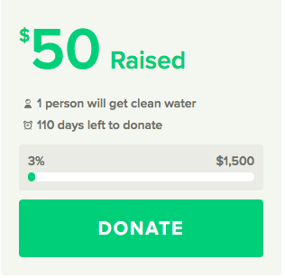
Follow these tips to upgrade your online donation form experience and accelerate fundraising goals.