

Table of Contents
What was Andrew Scheer’s policy for climate change in the Canadian 2019 elections?
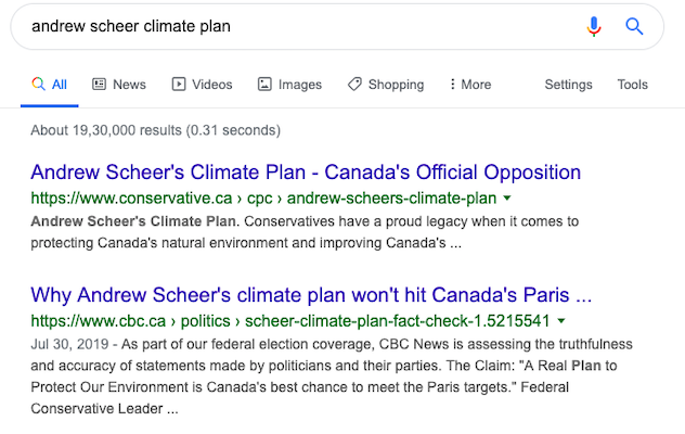
Unless you are a Canadian, or an ardent follower of political news, your natural response to this question would be to ask Google. When you do, this is the SERP you get:
Being found online is so essential that the Conservative party had a whole webpage dedicated to climate change (and their policies).
That is because supporters increasingly come online looking for information about the candidate or party (just like you did).
- It is easier, faster, and non-intrusive. Compared to a pamphlet thrust in your face, or walking to the campaign office, or waiting for the campaign brochures to arrive via mail, doing your own research is simpler online.
- Online platforms allow a direct dialogue with the candidate. Apart from direct campaign runs, supporters interact with the candidates only via television (or Radio). That is a strictly one-way communication, with no conversation. With an election campaign website, supporters can reach out to the candidate with questions, and get them to respond as well.
- The election campaign website acts as a rallying point for supporters and volunteers – with numerous ways to allow communication between each other.
So the merits of having a website for an election campaign is no longer questioned. In fact, it has evolved from “should you have an online website?”, to “how to build a superb online website for your election campaign?”.
This post can help you there.
Step 1. What is your primary website objective?
The first step in building your election campaign website is defining the objective of the website.
A good election campaign website is not something that ‘looks pretty’ or has great headshots of the candidate.
While these are nice things to have, the website will be an asset to your campaign, only if it is in-sync with the campaign strategy.
Let me give you an example. In the 2012 US Presidential elections (Romney Vs. Obama), both the campaigns had very different strategies.
Romney was running for the first time. So his primary objective was to build more supporters, get followers, and also raise funds for his campaign.
For Obama, since he was campaigning for re-election, his strategy was to inform his supporters (and non-supporters) what his plans for the upcoming term were.
Naturally, both their election campaign websites reflected the party’s priorities. Since the websites are either modified or taken down after the campaigns, here is a screenshot that compares both the sites:
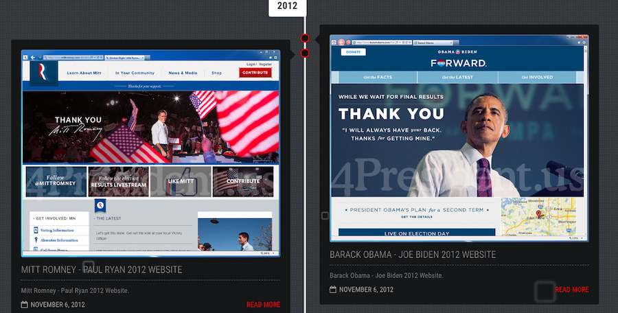
Pic Courtesy: 4President.US
While both these sites have a clear headshot, look at the message below the image. Romney’s site had options to follow him, become a supporter, and contribute to the campaign. In Obama’s site, what grabbed attention was his upcoming policy plans for the next term.
For you (or your candidate), the objectives could be totally different. It could be a combination of both the above. Or, it could be establishing your candidate as a viable option in the upcoming election run.
Define and understand these objectives clearly before going to the next step in website building.
Step 2. Choosing a domain name
Now that you know what your website should do, you can go ahead and get the technicalities sorted out.
The first order of priority here is picking a domain name. Your domain name is but an expansion of your own branding. So, you can choose to just have your name (e.g., www.donaldjtrump.com) for your domain name.
However, if you are a new candidate, who is running a tight race, you can choose differently. For instance, in the upcoming 2020 US elections, there are more than a dozen democratic nominees who are running for office.
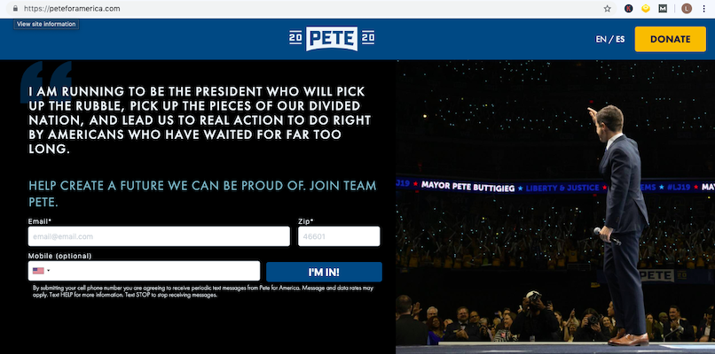
In such a neck-to-neck race, to differentiate himself further, Pete Buttigieg’s website domain is www.peteforamerica.com.
Such a domain name also subtly drives home Pete’s campaign message of striving for an American future to be proud of.
Another similar example is the domain name of the democratic primary Julian Castro. It is www.julianforthefuture.com.
Regardless of which strategy you pick, remember to keep the domain name evergreen. That way, you can still use the website between campaigns and not let it go dark. It will ensure that all the SEO juice, engagement, and social media links etc. are not lost.
The website name www.tulsi2020.com, for instance, is clearly timebound. In case Gabbard decides to compete in the next elections, she has to start over, with a different domain name.
Step 3. Picking the skin’/theme/template
Once you have chosen your domain name, pick a ‘theme’ to base your site on. Based on your campaign funding, you can choose to custom make a website from scratch.
If a political consulting firm is helping you with this, then they will offer a bunch of templates you can choose from.
By rule of thumb, a good template would give you multiple home page options, allow you to be flexible with the color scheme, and also make changes to the existing template easily.
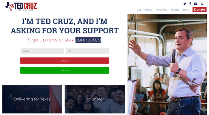
If you are on a budget, using WordPress for your site (it’s free) will definitely work in your favor.
A recent political candidate who used WordPress is Ted Cruz. Since his campaign was funded via public contribution, winning donations was a primary goal. That is why he had two donation options (the right-hand button and the green donate button).
His site also enabled him to sign up volunteers, add videos, have a donation form, and pull in social media.
The right theme or template will hugely depend on what you want the website to accomplish. The WordPress theme you are looking at (e.g., Nominee or Politist) should enable you to have the right features for your goal.
For example, say you want your website to compliment your campaign strategy, and convert visitors to supporters.
Then your theme should enable you to have social sharing buttons, embedded forms that collect and send supporter information to your database. It would also be great if your website allows visitors to engage with volunteers in real-time.
Even if you do not get a theme with all the above features, see if you can modify the template easily to adjust to your requirements.
Step 4. Get the key elements in place
We already discussed what the objective of your site should be. While that is the central theme of your website, there are a few key elements you cannot ignore.
Regardless of what objective you pick, these key elements are essential in driving home your message, converting supporters, and winning more donations.
1. The ‘About’ section of the candidate
How you position yourself to the electorate goes a long way in convincing your visitors to trust in you.
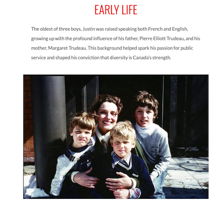
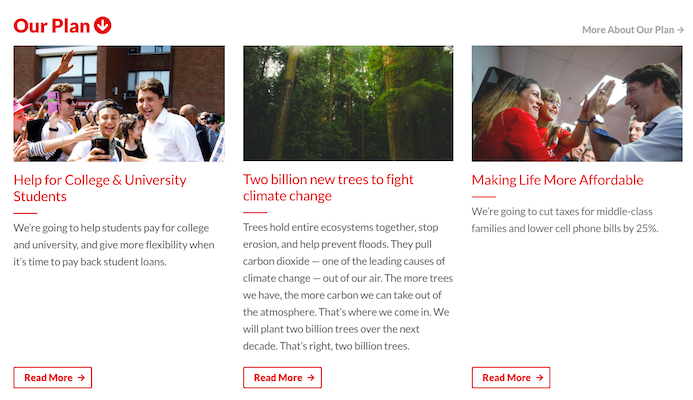
Take Justin Trudeau (the Liberal Party leader who won re-election in Canada 2019 elections). He talks about his early childhood, what motivated him, and how that has shaped his career in politics now.
Elizabeth Warren has taken a similar approach to her election website. She talks extensively about her early life, her struggles, and her journey to what made her a Presidential candidate today.
Both their websites are broken up with high-quality images, and ‘real’ photos that help voters relate to the candidate.
2020 political website trend: Rich about pages that make the candidates seem more ‘real’ to voters.
The chances are that most voters do not meet the candidate (except perhaps at a rally). So they find it difficult to relate to them. Such rich about pages make it easier for voters to identify with the candidate.
2. The Donation page
Even if you are Donald Trump (who can comfortably self-fund campaigns), you would not say no to contribution coming your way (he doesn’t. He has a prominent ‘Donate’ button on his site).
Having a donation page enables supporters to make a contribution easily. When you are setting up your donation page, here are a few things to consider:
How prominently do you want the ‘Donate’ button to be?
This decision ties back to the campaign strategy and website objective. If your campaign is heavily funded by the public, you may want to make the donation button more obvious.
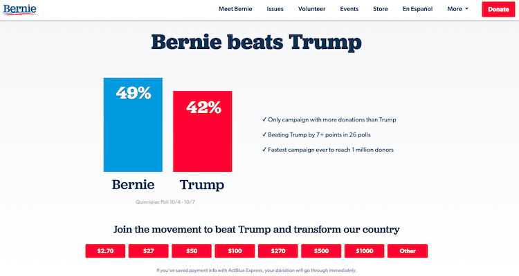
A good example here is the Bernie Sanders website. Since he is solely funded by public contributions, winning more donations is a top priority for his campaign. It is reflected in his campaign website. It shows a “Donate” button and a “Store” button prominently on the Top Bar.
This is further enunciated, right after the first fold. Typically, this space is reserved for either ‘breaking news’ in politics or the candidate’s stance on various policies.
Bernie has chosen to ignore that convention and has stressed the importance of donating to his campaign.
Do you want to consider standard donation options?
In the same example, you can see that Bernie has made it easy for his supporters to donate. He has given fixed donation amounts that supporters can directly pick.
His donations start from as low as 2.70 dollars – a great way to win contributions from supporters who do not have much money to spare.
He has also given an ‘Other’ option where the contributor can manually fill in how much he wants to give. Such an option makes it easy for every kind of supporter to contribute.
Would you like a full-width donation page?
Kamala Harris has an interesting take to win donations. When you click on her website link, you are not directly sent to the website.
Instead, you are first shown a donation form (rather like a pop-up). Thankfully, this is not compulsory. You can either choose to donate or move on to the main website.
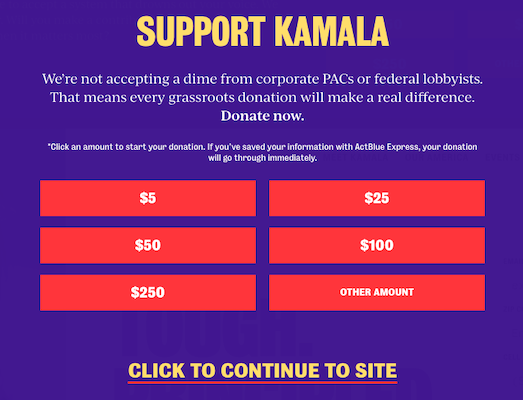
Even on the main website, the “Donation” button occupies a full-page width and is not just a small form tucked away in the right.
Both these aspects highlight how critical an aspect donation is for her campaign. For your website, you can choose how to position your donation button.
If you are at the initial stages of your campaign, where raising money is still a huge priority, you can try the above strategies to see what works best for your campaign.
2020 campaign website trend: Use sticky donation forms.
A subtle, yet powerful way of persuading supporters to contribute online is making the donation form ‘sticky.’
Warren and Pete both use this trend in their election campaign website. They have anchored the CTA to the bottom of the page, thus not distracting visitors from the main header.
3.The volunteer recruitment form
Your election campaign website is also the best way to recruit more volunteers and identify supporters. Having a “Get Involved” or “Volunteer” button allows interested supporters to help your campaigns.
As a rule of thumb, most websites have this button on the top bar (usually right before the ‘Donate’ button).
Once interested volunteers click on this button, they are redirected to the sign-up page, where they can choose how to help the campaign. Here are the usual options:
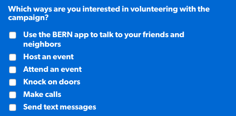
Kamala’s website goes one step further and asks the volunteers to write a few words on why they support her campaign.
Such extra information will make it easier for your campaign to manage volunteers later on.
Pete’s campaign website, however, has elevated volunteer recruitment to a much bigger priority. An interested volunteer can engage with his campaign directly from the home page.
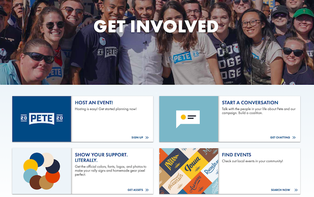
To further simplify the process, it first asks them how they want to be involved and then moves on to collect key details about the volunteer.
For your election campaign website, you can choose any of these methods. Just remember to keep the form succinct and collect information strictly pertinent to your campaign.
2020 election website trend: Redirect supporters to donation pages after they sign-up.
Quite a calculated move – because interested supporters (who have just made a commitment to help your campaign), would be willing to chip in funds as well. Paul Cunningham, running for Senate, uses this strategy on his website.
4.Communication/email sign-up form
If you take a quick look at the top election campaigns right now, the most obvious ask they have is “Join the team.” That is, you do not have to be a volunteer, but just sign up with an email and phone to receive regular updates from the campaign.
That means you have potentially won the details of a supporter – someone whom you can later drive up the ladder of engagement, or use for your GOTV efforts.
Warren’s site is pretty interesting here. Her volunteer form and supporter form are the same.
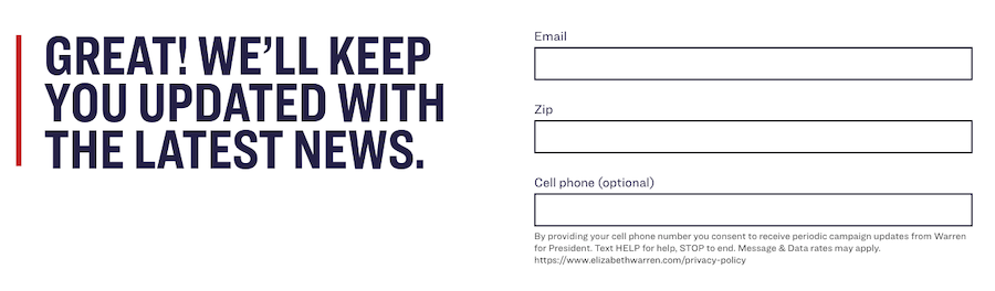
That is, she does not have a separate volunteer sign up sheet like Bernie and the others.
This could be a way to encourage more sign-ups and build momentum for the campaign and later convert these supporters to more active volunteers.
2020 election website trend: Make your forms mobile optimized.
Even though mobile-optimization should not be a ‘trend’ today, but a norm, not many election campaign websites use it well.
A few exceptions are like Kamala, whose website renders well on mobile, with simple scrollable and clickable CTAs.
Another good example to follow are both Warren and Pete. They have gone ahead and used ‘Hamburger menus’ (the three lines that expand to give the menu), even on their website – thus giving them more real estate to work with.
It shows that adopting mobile trends is not a one-way street. You can customize your desktop to resonate better with a mobile-first generation!
5. Party/candidate stance on issues
This forms the core of your website. A major portion of your website should be dedicated to what your stance is on various issues. Eg. Trudeau’s election website has it immediately below the fold.
I would like to reiterate here that the content strategy for re-election campaigns and first time running campaigns are hugely different.
Re-election contenders like Obama (in the past) and Trudeau (just now), tend to focus more on how much they have accomplished in the past term.
Such campaign websites have a tab on “Progress” or “Promises achieved” right on the top bar of the website.
One more thing to keep in mind is the kind of issues you want to highlight in your election website.
If it is a race strewn with controversies (most campaigns are), and one particular political stance is causing you a lot of grief, then you would want to stick to policies that are not too polarising.
If it is a tight race between multiple parties (e.g., the race between democrats right now), you can choose to highlight those issues that set you apart from the others.
2020 election campaign trend: Grab attention with ambient video.
In the hero shot, instead of having a static image, see if you can incorporate a video (faded to background), that highlights your campaign efforts. Warren, Cunningham, and a few other contestants are using this trend.
If a video is not possible just yet, see if you can employ subtle animations on your site. For instance, Pete draws attention to his email-sign up form by having it drop down a few seconds after the page loads.
6. Links to social media pages
Enable your supporters to like, follow, and support your campaigns on social media as well.
Your website should have social sharing buttons (prominently placed) to encourage supporters and website visitors to engage with you on social platforms as well.
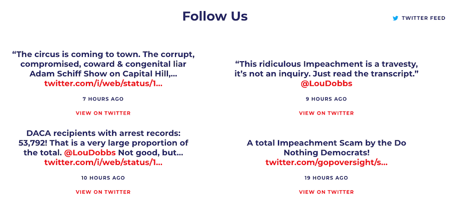
2020 election website trend: The latest tweets by the candidate is pulled in and shown on the website to highlight current discussions on a particular topic.
Apart from these key elements, it would be ideal if your website has good navigation and legible design.
Every visitor who comes to the site should be able to get what he wants with minimum clicks. Also, they should not be overwhelmed or distracted from your primary objective (donation/sign up) by poor design.
Step 5. Keep up with the campaign
An election campaign website is dynamic. It changes and evolves with how your campaign takes shape.
For instance, in the preliminary part of the race, when you are focussed on fundraising and getting voter information, your website should reflect these objectives.
You will have a clear donation form or even a merchandise store from where supporters can make contributions.
With time, you will subtly bring more attention to the issues you support and the policies you take a stance on.
More importantly, the website does not exist in a bubble. Any change in the political climate should reflect in your site too.
Have a key message to your supporters from the democratic debate? Make that front and center.
If your debate is going live, add a top bar (as notification) to your site and encourage visitors to watch the video.
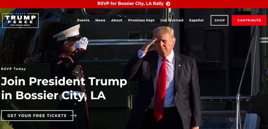
Here is one such example: President Trump having a sign-up form for his upcoming rally.
What next?
Never forget that a good election campaign website is just a part (albeit a crucial part) of your digital arsenal. It can be successful only if it is used seamlessly with other tools.
For instance, check out the sign-up forms in Warren’s campaign. Right below the form field, it mentions that you can receive updates about the campaign, by opting in with a keyword. That right there is an excellent way to link your website to your SMS campaigns.
Similarly, once a supporter makes a contribution, you can shoot out a thank you text to his mobile phone. Not only will it make the supporter feel appreciated, but it also speaks about the sophistication of your campaign.
These are just two examples. Based on your campaign requirements, you can enable multiple calling and texting campaigns to unify your communication. CallHub can help you there.
If you want to know more, shoot me an email at [email protected]. We can see how to set up calling and texting campaigns for supporters who sign up.