


Take a look at these two CTAs on a pet adoption landing page:
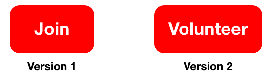
Which of these would be more suitable for the page?
Of the two, ‘Volunteer’ would work better. It is straightforward, actionable, and gives a better picture of what the prospect should expect.
However, there is still scope to improve on the CTA and make it more effective. Also, what is considered an ‘effective CTA’ changes based on the channel and the behaviour of prospects in that channel?
For instance, ‘volunteer’ would work well on your website, but may not get you enough clicks on an email
Clearly, creating a strong call to action is not a straightforward process. But it is still essential – to get more donors, supporters or email subscribers
This post can help you there. We have done the heavy lifting and compiled a list of best practices to create an effective call to actions for 3 major channels – website, email, and text. Each of these practices is accompanied by examples to inspire your creativity.
What is a Call To Action?
A call to action (CTA) is a part of a webpage, advertisement, or any piece of content that encourages the audience/readers to take action. The idea is to give the prospect a clear direction of what to do next (and how).
The CTA can be of any form including:
- A button on a website or advertisement
- Hyperlinked text in an email or SMS
- A short link within or after a piece of content
- Verbal question/instruction during a phone call
Why do you need a strong Call To Action?
It is quite simple and – an effective call to action converts better Organizations put in a lot of time and effort into creating a website, ad, text message, etc. and getting them in front of prospects.
The ultimate goal of these efforts is to convert these prospects to leads. However, all the effort will become moot if the prospects are not inspired by the CTA to take the action you require of them and convert. That is how crucial an effective CTA is.
But remember, the purpose of a call to action is not just to tell someone what to do and why. It is also supposed to convey urgency and be relevant to the page (or content). That is what makes it a “strong” call to action.
So, how do you create an effective call to action? Here are a few tips to help you out.
General best practices for CTA
Call to action statements
Call to action statements are the texts that appear within a piece of content (or on a button) to motivate action.
There are three recommendations for the call to action message that you must follow:
1. Use strong actionable verbs
To improve your CTA click-through rates, clear, compelling, actionable words (e.g. change, act, fight, explore, send, join) go a long way.
For example:
- To subscribe to your newsletter, you could say: Send me tips
- To encourage volunteering: Join the fight
- For donations: Make a donation
2. Create A Sense Of Urgency
Use persuasive language to make prospects feel like waiting isn’t an option, and they need to act right now. Adding words like “Today”, “Now”, “Instant” to verbs will help make the difference.
For example:
- To subscribe to your blog: Get instant access to tips
- To encourage volunteering: Join the fight today!
- For donations: Make a donation now!
3. Keep it concise
Typically, you don’t have a lot of space for your CTA. So it has to be short and get your point across quickly.
For example:
- Instead of saying: Click here to make a donation; you can just say: Donate now
- Instead of saying: Volunteer for the cause today!; you can just say: Act now!
Note: While the long call to action messages also incorporates the first two suggestions, generally it’s good practice to keep it short.
Use design to capture attention (for CTA buttons)
The best practice for an effective call to action graphic is a simple design and the right combination of colours. The button, however, should be able to grab the user’s attention. The following tips can help you achieve that:
- Choose a contrasting colour for your CTA button. It should stand out from the overall theme (colour) of your webpage or email.
- Make the button 20% larger than the logo. This size is good enough to catch the user’s eye without seeming too jarring.
- Use a rectangle or square button. It can have rounded corners, bevelled edges, or shadow effects. But stick to this format because that is what people are familiar with. The human brain craves familiarity, so messing with that may reduce the impact.
- Stick to 2 CTA buttons per page. You don’t want to distract people with too many buttons. For long pages (like a homepage), you can have more CTAs but make sure they don’t show up very frequently.
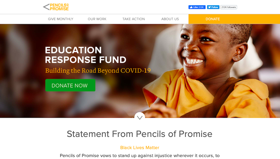
Pencils of Promise uses just two Donate CTAs on their homepage. Both CTAs have a contrasting colour and are large enough to get noticed.
Test Your Call-To-Action
Test the copy, design, placement, and visuals. You can do it with A/B testing tools that help you identify which CTA performs better based on real-time data and statistics.
While creating your A/B test versions, change only one or two details so you can accurately determine what influenced the results.
When changing more than one detail, ensure you don’t make multiple variations of the same element. For instance, change one aspect of the button and one feature of the surrounding media (rather than two elements of the button).
Here is an example of how managers of Obama’s political marketing campaign tested their conversions:
Variation 1:
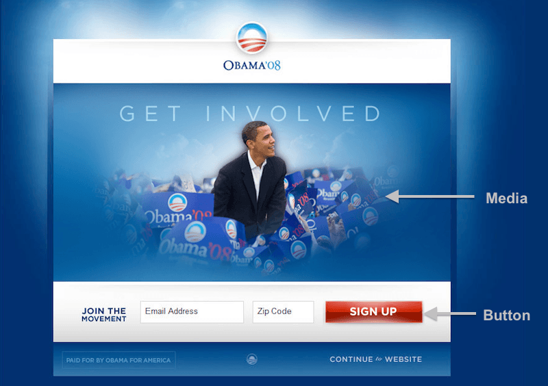
Variation 2:
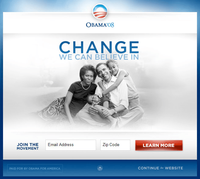
The first version assumed that the visitors coming to the website had a clear idea about the candidate and were invested in him.
In the second version, they aimed to provide visitors with an idea of the campaign message and an opportunity to learn more. This assumed that most of them were in the initial stages of the voter journey.
It turned out that most of their audience were those looking to learn more about the campaign which is why the latter saw a 40.6% increase in sign-ups.
Testing your CTA helps you learn more about your audience. This, in turn, gives you a better idea of what they want and what would inspire them to act.
Effective call-to-action examples for specific channels
I. CTA for website
Your website is the hub of all information about your organization. Typically, prospects are driven to your site for this data (to learn more about your organization, read something interesting you may have published, etc.).
An effective call to action on your website serves as a motivator for prospects to take additional action apart from what they came looking for.
For example, a prospect may come to a nonprofit website to read about their work. A good call to action may get them to donate for the cause or even sign up for a newsletter.
For a website CTA (or any other CTA for that matter), to inspire action, there are two critical things you need to keep in mind:
1. Button elements
The shape, colour, and text of the CTA button collectively work towards motivating visitors to take action. You need to ensure that these buttons stand out and encourage clicks with the following practices:
- Button shape: Generally, it’s best to stick to a classic button format (as shown) for a CTA, but you can get a little creative with it, as we mentioned earlier.

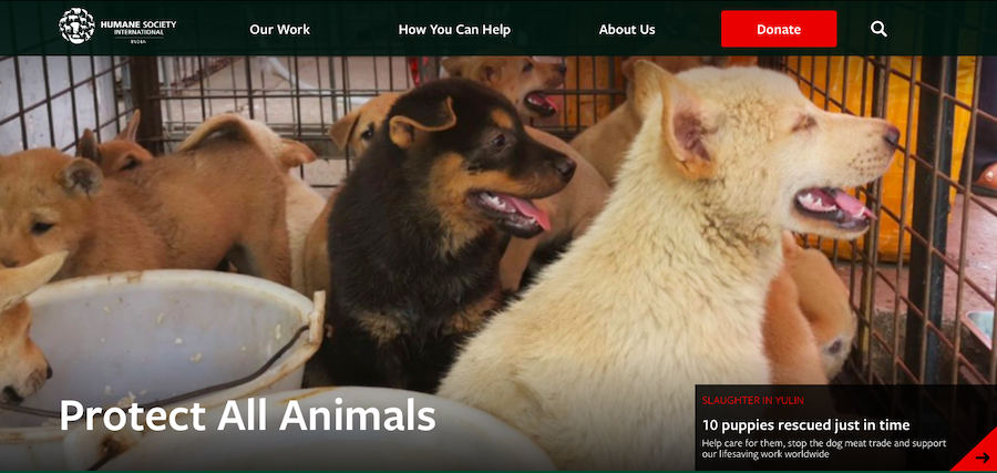
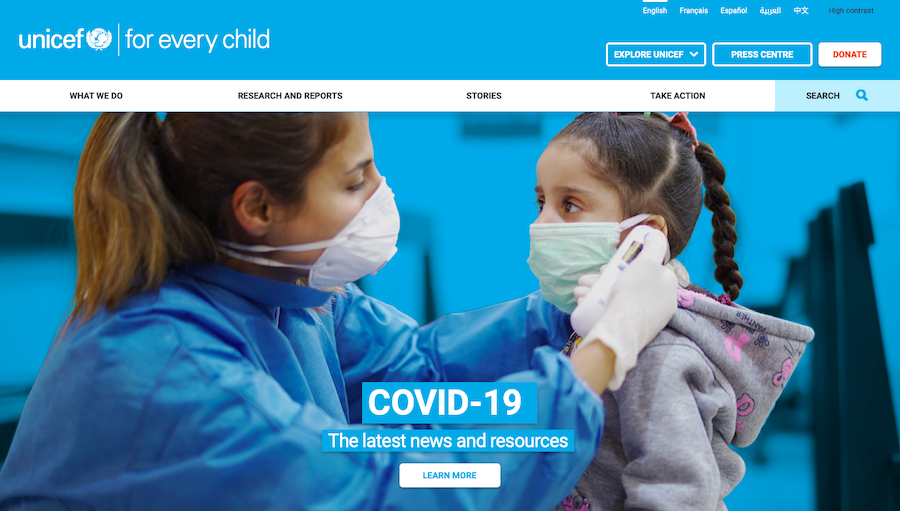
- Colour: The colour of a strong CTA contrasts with the website’s main theme. This contrast allows it to stand out and grab the user’s attention. Here’s an example of the Humane Society’s distinct, red “Donate” button.
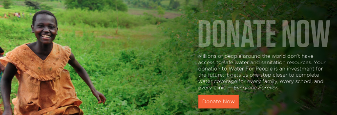
- Call to action text: Use text that gives the user a clear idea of what to do, what to expect, and creates a sense of urgency. For example, water for people implements this with a simple keyword “Now” and reinforces the urgency with the surrounding text.
2. CTA placement
The placement of your CTA also affects the number of clicks it gets. Typically, the best places on your website where it is most visible are:
- Above the fold: Over 57% of a user’s time is spent above the fold. It’s only logical to have a good call to action here. You can either place a CTA in the header or somewhere in the middle. A safe bet is to put two of the same or different CTAs in both places.
Note: Above the fold is the top half of the webpage, the part of the page that is visible at first glance without the viewer having to scroll down.
- Below the fold: The CTA below the fold should be relevant to the page’s content. For example, the 350.org homepage displays excerpts from their campaigns. When a user scrolls down, they have CTAs for more details on their work.
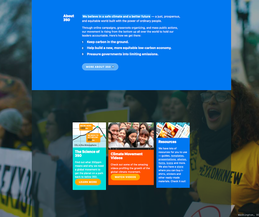
Note: “Donate” or “Join now” buttons wouldn’t be practical here as the user may not be clear about the impact. The uncertainty would make them reluctant to act on high-barrier-asks.
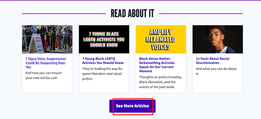
- End of the page: If you make major asks (donate, join, etc.) above the fold, it is best to make a lower-barrier ask here.
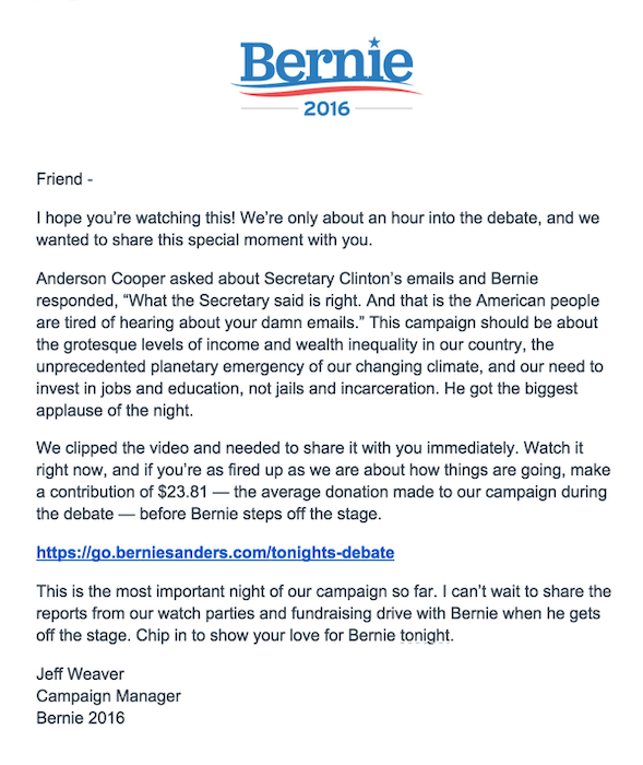
Here’s an example of how Charity: Water implements this:
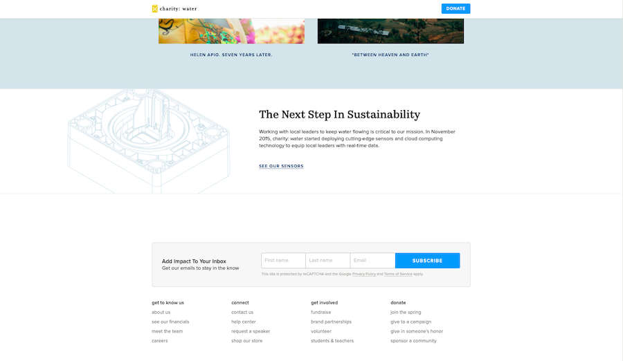
Since they skipped the CTAs above, it’s unlikely they will click on it here. However, if you can’t get a supporter or donor, you can at least get a subscriber or follower to be nurtured
II. CTA for email
The objective of an email is to nurture a prospect and motivate them to take action (which typically redirects them to another page for that). Unlike websites, the CTA represents the email’s primary objective which makes it vital to have a strong one.
There are primarily two types of CTAs for emails:
- Button CTAs: These are used for HTML or graphical emails.
- Hyperlink CTAs: These link CTAs are used for entirely textual emails
There are best practices for each of these types of CTAs that you can use to enhance their effectiveness.
1) Email button CTA
Just like for website CTA buttons, there are two things that you need to focus on for button CTAs in emails.
i) Button elements
In email call-to-action buttons too, the shape, colour, and text work to inspire people to click on them. The best practices for them are similar to those for a website.
- Button shape: Regular button format with some room for creativity.
- Colour: Contrasting colour for CTA to stand out within the email.
- Call to action text: Concise and actionable text.
ii) CTA placement
- The bottom centre of the email: A heatmap analysis on emails concluded that the maximum click-through rates were on emails with an inverted pyramid design. The end of the pyramid is where the call to action should be placed, like in the example below.
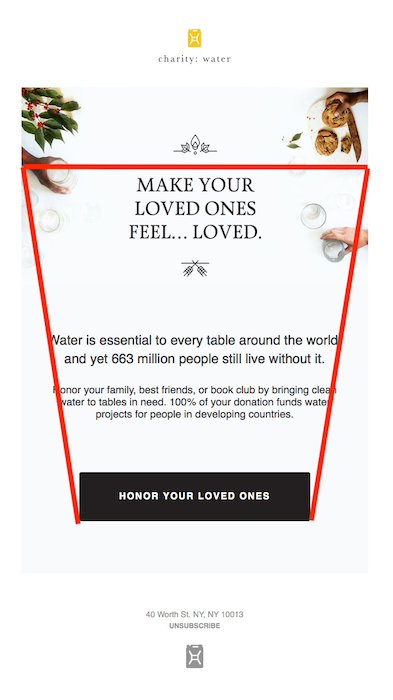
- Multiple CTAs in multiple folds: For long emails with a variety of options for actions, it’s best to have multiple CTAs in multiple folds. You can still follow the inverted pyramid design, just like the Patagonia Action Works newsletter.
While adding multiple CTAs may seem tempting, there is a downside to it. Multiple links can be distracting and may reduce the likelihood of readers clicking on anything. This characteristic is known as the paradox of choice.
This placement works fine for newsletters with a lot of information and no focus on a specific action. But, for emails sent with the objective of making a high barrier ask, like a donation, it’s best to stick to a single CTA.
2. Hyperlink CTA (call to action link)
Similar to any other CTA, you have to keep in mind the elements and placements of hyperlink call to actions too.
i) Elements of Call to action link
- Link colour: For most emails, linked text automatically changes to a shade of blue, which is perfect (remember the concept of familiarity). However, you can experiment with other shades too if the standard blue is not interesting enough.
- Anchor text: The clickable text in the email is the anchor text. Your anchor text should be compelling, actionable, and relevant (to the page that is linked).
For instance, if linking to a donation page, ensure that the text clearly specifies it: “Make a donation” or “Click here to donate.”
Note: Since text emails provide you with more room to express yourself, you can use CTAs that are a few words long. An effective call to action is concise, but not necessarily ridiculously short.
ii) Placement
- Within the text (in a paragraph): You can place the link within the content of the email, typically when you talk about that action. However, ensure that it is distinctly visible, like in the example below.
Notice how the link colour is not the standard blue. It matches the colour of the specific points they highlight in the email. They also use multiple CTAs in the copy.
Yet, they manage to draw your attention to the primary one with the right formatting (bold and underline) and paragraph spacing.
- As an independent line: If the anchor text you’re using is lengthy, place it as a stand-alone line or paragraph. Having the link at the end of the email or in the middle is something you can A/B test for. Here’s an example of an email from Pete Buttigieg’s campaign for voter outreach.
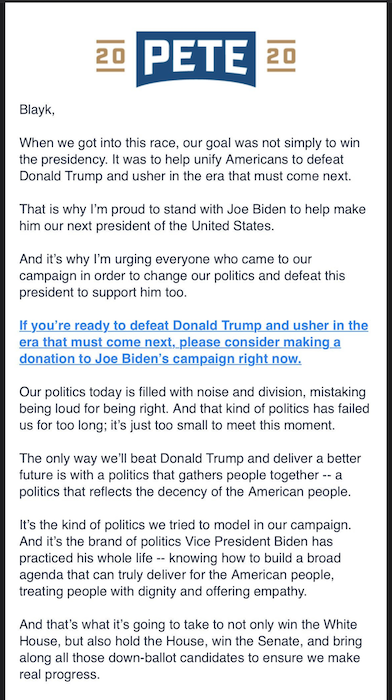
Notice how the email eliminates distractions with just one CTA and makes good use of whitespace to draw attention to it. The stand-alone line also ensures that the long anchor texts aren’t skipped by any chance.
III. CTA for Text
Texts are sent with the objective of either providing information or getting people to take action. For the former, a call to action is good to have but not necessary.
For texts being used to drive action, there are typically two types of CTAs:
- Hyperlink CTA: A call to action statement accompanied by links.
- Keywords: A keyword that is texted to a shortcode to receive information or take action (for example, text to donate).
For each type of CTA, there are a few things you can do to maximize their reach and impact.
1. Hyperlink CTA
In-text messages, a hyperlink CTA has the following structure – Call to action statement: hyperlink. The link usually leads to another page or piece of content where the prospect takes the desired action.
i) Elements of SMS Call to action link
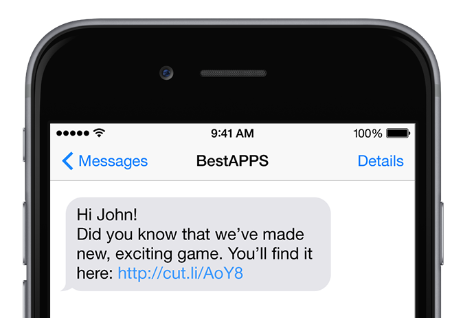
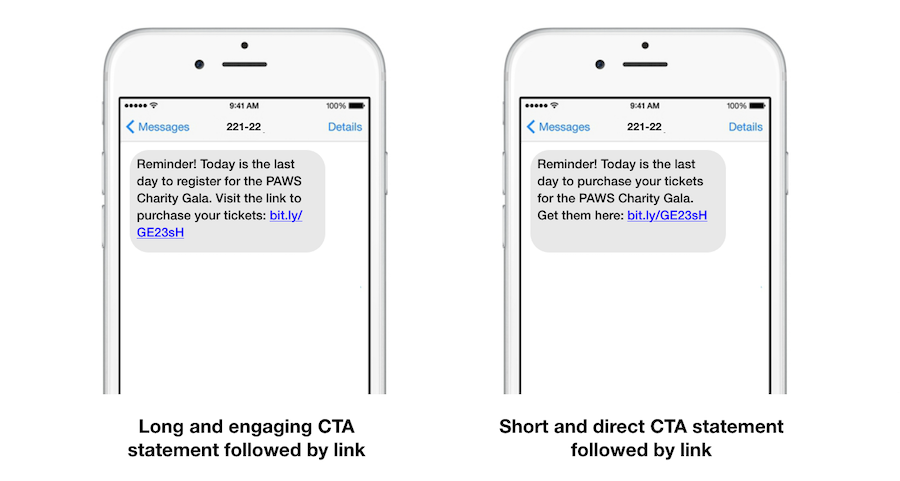
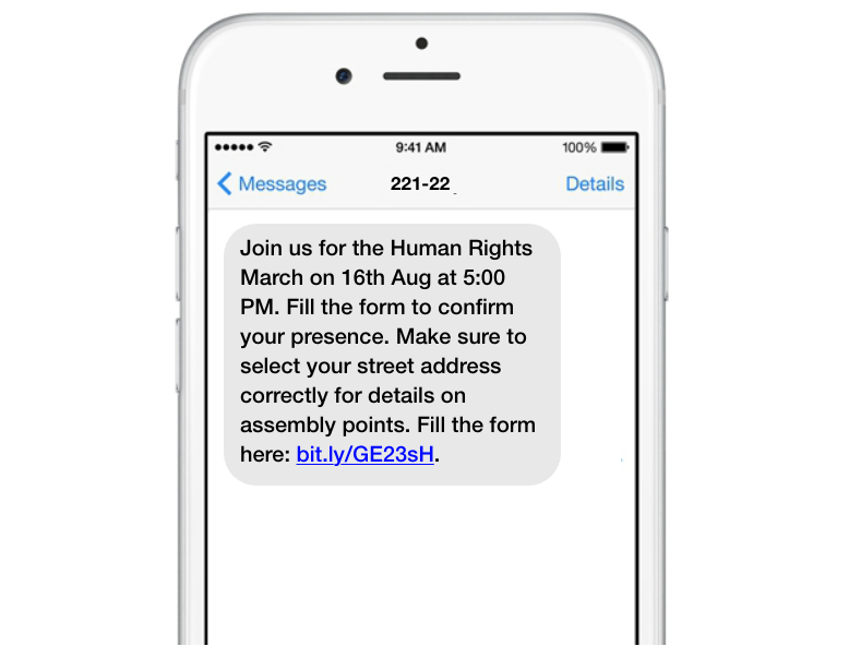
- Call to action statement: The call to action statement instructs the prospect of what to do. Use actionable phrases like “Visit the link” or “Get it here” for clarity. Generally, the best practice is to have the statement right before the link.
For SMS CTA phrases, there is no fixed rule for the length. You can A/B test the ideal length that works for you.
- Shortened link: Since text messages have a limited character count, shortened links are recommended.
More importantly, ensure that these shortened links are clickable and don’t appear as standard text, which is quite common.
ii) Placement
- In between the message: Place the link in between the message if the page the user is directed to is self-explanatory. Typically, businesses leading user’s to a shopping site prefer this placement.
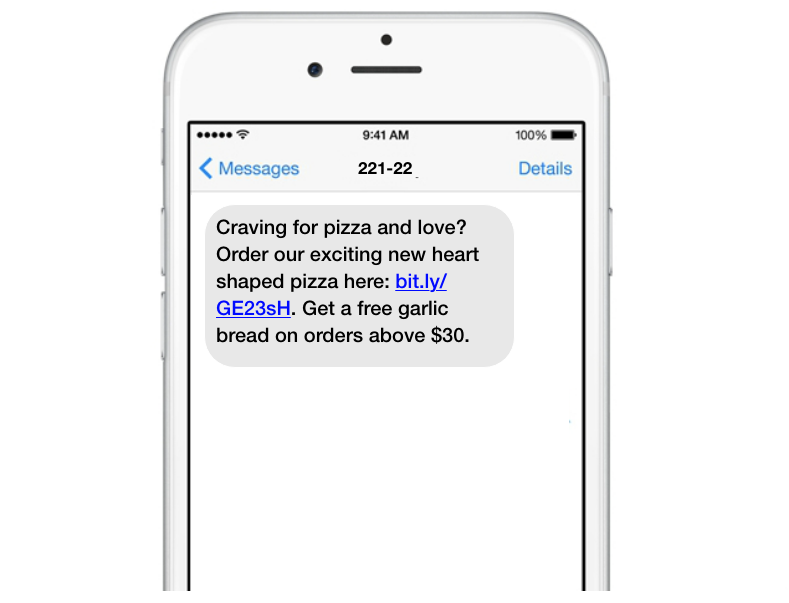
- At the end of the text: If you need the person to know something important before clicking the link, place it at the end. It is a simple way to ensure the user reads the entire message before clicking.
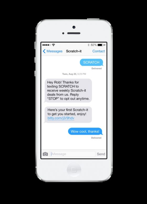
2. Keywords
In SMS marketing, opt-in keywords are a type of CTA that inspires users to act, i.e. initiate a conversation with you by texting the keyword to a shortcode. You can then follow up with more details on how to take a specific action (like a form link for text to donate), general updates, or request for information (email id, names, etc.). Since they fall under the CTA category, there are certain best practices that you need to apply here too.
i) Elements of an opt-in keyword
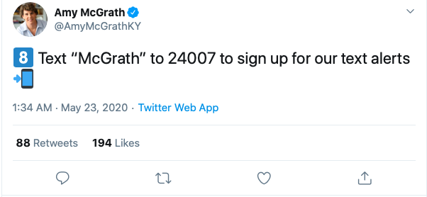
- Keyword: Choose a keyword that is relevant to your organization or to the action you want people to take. For instance, use a word like “Donate” or “Give” for text to donate campaigns.
Also, you should stick to using one or a maximum of two keywords. Remember that you can’t have spacing between the words so multiple words may become complicated or difficult to remember.
- Shortcode: The number to which the keyword is sent. Use a shortcode that is easy to remember. For instance, for his presidential campaign, Barack Obama used the shortcode 62262, which spells “Obama” on a cellphone.
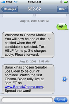
Example of keyword CTA in play from Barack Obama’s vice president announcement campaign
ii) Promotion
To inspire people to pick up the phone and text you, you have to promote the keyword and shortcode on various platforms. But remember, you can only encourage people to opt-in if you provide them with some value. Therefore, when promoting the keyword, make sure to include as to why people should act on it. A few examples of how and where you can promote your keyword are:
- Social Media posts: Place the shortcode and keyword on your social media posts with a simple message encouraging people to opt-in.
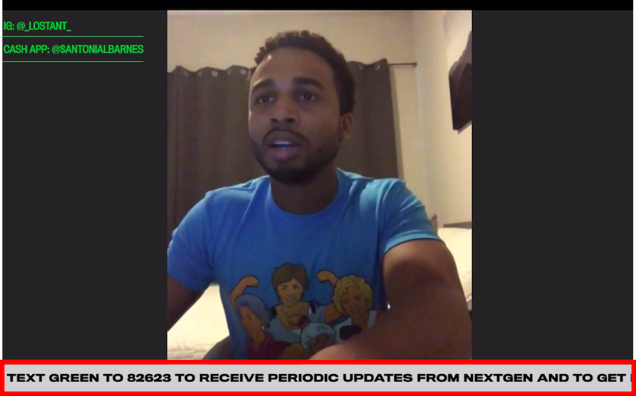
- Virtual events: You can also plan virtual events with a news ticker to promote your text CTA.
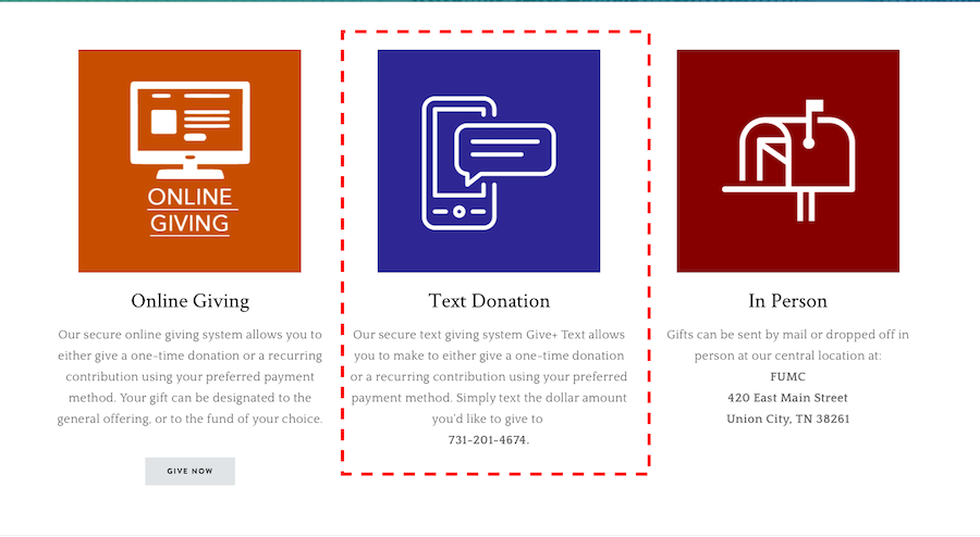
- Website donation pages: Some organizations also promote the SMS CTA on their website as an option to give.
When it comes to promoting your keyword, there are no set rules. You can be as creative with the promotions as you would like.
To conclude
With this info, let us revisit the supposition that ‘volunteer’ would work better on the pet adoption landing page.
What this CTA would do is boost volunteer recruitment. If the objective of your landing page is to get more pets adopted, then Adopt a pet today would be more suitable.
Here again, there are a few options that can work: Adopt a pet today! Take your friend home – are all options that you can test to see which works.
There’s a lot that goes into creating an effective call-to-action. But it all starts with understanding what you want the prospect to do and on what platform.
Hopefully, these tips help you craft impactful CTA’s that drive more action and conversions.